Lines
Lines is an interactive, stacked line graph viewer. Lines allows you to mine multiple numerical-based signals on a shared x-axis and y-axis. Quickly measure time and magnitude in your web browser.
Waves
Waves is an interactive, multi-row waveform viewer. Waves is a powerful, interactive data visualization that lets you mine data by zooming in/out, collecting targeted statistics, mathematical transformations, and so much more all in your web browser.
Click here to learn more detailed information about how to use Waves.
Amplify Signals
To amplify the view of any signal in Waves, simply highlight the desired signal(s) and select Tools -> Amplify Signal+ / Amplify Signal- from the top toolbar.
The keyboard shortcuts for amplifying signals are the '+' and '-' keys.
You can highlight multiple signals for amplification by holding the CTRL/CMD key and clicking on each signal name. You can highlight a group of signals in-line by holding the SHIFT key and clicking on signal names. You can highlight all signals with CTRL+a or CMD+a. You can deselect all signals with CTRL+d.
You can also amplify signal(s) by selecting the desired signal(s), right-clicking on the signal name, and selecting amplify+ or amplify- from the pop-up menu.
Spark Lines, Pin, & Labels

To change the view type of one or more signals in Waves, right-click on the desired signals and select the view type from the drop-down menu, -> view as spark line, view as event pins, or view as labels.
Signal Statistics
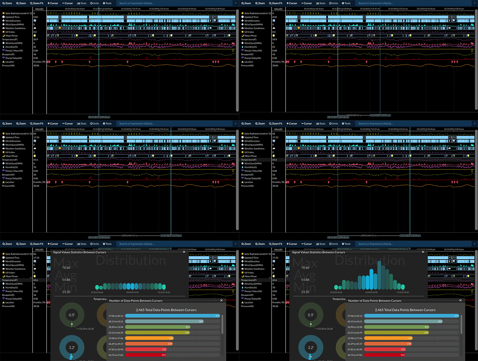
# of Data Points - The # Data Points function calculates the number of data points for every selected signal in the highlighted area between the two cursors. If only one cursor is present, the total number of data points for the selected signals is displayed.
Signal Stats - The Signal Stats function computes basic statistics for a selected signal based on just the data values in that signal. Time is not considered in the statistics generated by the Signal Stats function. For example, if a signal has a value of 60 for 59 seconds and 0 for 1 second, its average value is simply 30 as time has no effect on the calculation.

If the signal is drawn as a spark line (i.e. the signal contains all numerical values), Stats -> Signal Stats will generate a distribution (histogram) chart as well as the max, average, and minimum values for just the data highlighted between the two cursors. If only one cursor is present, the statistics are generated for the selected signal's entire data set.
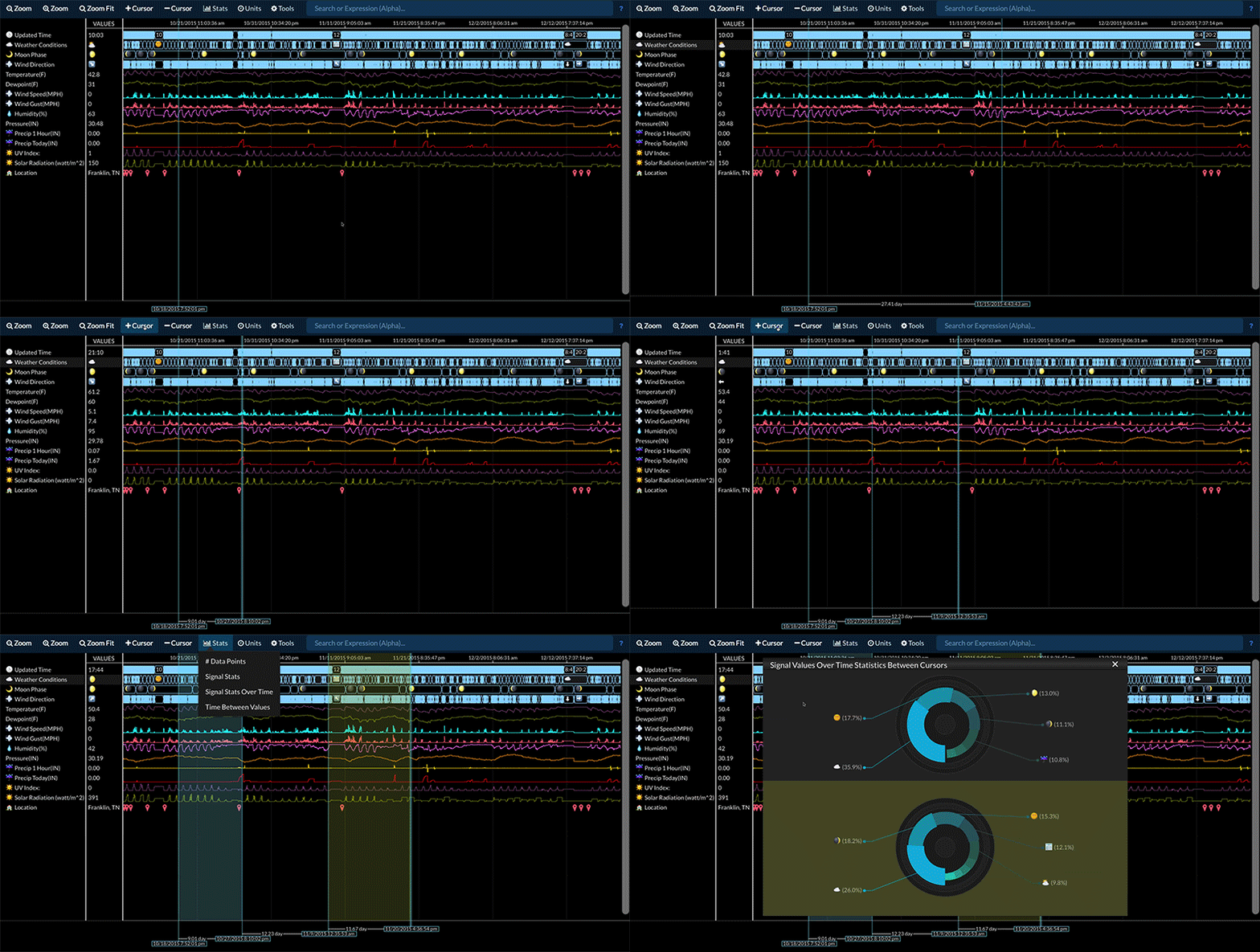
If the signal is drawn as anything other than a spark line (i.e. the signal contains non-numerical values), Stats -> Signal Stats will generate a pie chart containing the count of each unique value type contained in the region highlighted between the two cursors. If only one cursor is present, the statistics are generated for the selected signal's entire data set.
If multiple signals are selected (using CTRL/CMD or SHIFT to select multiples), Stats -> Signal Stats will generate a stacked bar chart comparing the total value count for each unique value in each signal for the region highlighted between the two cursors (or the entire data set if only one cursor is present). This is only a useful graph if there is a relatively small number of unique data points in each signal.
Signal Stats Over Time - The Signal Stats Over Time function is similar in functionality to the Signal Stats function but takes into account time in all calculations. For example, if a signal has a value of 60 for 59 seconds and 0 for 1 second, its average value over time is 59. Instead of displaying total data point counts, the Signal Stats Over Time function will display total time for each unique data point.
Time Between Values - The Time Between Values function creates a new signal that contains the time measurement between data points for a selected signal. Only the data points in the highlighted region between two cursors are used for this calculation. If only one cursor is present, all data points for the selected signal are used. The newly created signal will contain numerical values in the same unit as selected in the Units menu. The signal name will contain the time unit used (e.g. Time(hour)). The newly created signal can have statistics generated on it like any other signal. This allows you to compute the average time between data points by running the Stats -> Signal Stats function on the created signal.
Transforming Data with Equations
Real-Time Expressions allow you to instantly manipulate, transform, and filter data inside of Waves. This allows you to make changes and calculations on your data without having to export your data to another application. For example, you can convert a temperature signal from units Celsius to Fahrenheit by simply typing the expression =convert([signal],"C", "F").
Go here to learn more about Real-Time Expressions.
Compare Two Time Periods
Statistics for a data stream between two time periods can be compared by:
- Selecting the desired data stream.
- Adding cursors so that there are either three or four cursors present.
- Selecting Stats -> Signal Stats or Stats -> Signal Stats Over Time.

Adding a Note or Annotation
A note or annotation can be added and attached to a specific signal and timestamp by right clicking on the signal at the desired time and selecting add note. Type the desired text and press enter to add the note.
There are no limits to the number of notes that can be added to a signal or data bucket.
Annotations are not available in Lines, it is a Waves feature only.